Insights + Benchmark + Navigation improvement
Hello Energy always strives to provide a professional, trustworthy, and user-friendly product. We do it by improving data clarity, and maintaining consistency across the platform.
This update will not only enhance usability which are immediately beneficial for users, but in the core, we’ve enhanced the consistency, clarity, and reliability of data presented in the Hello Energy portal. Through this, we show that our promise and stance: we are a high-quality data processing partner.
What’s new?
Insights
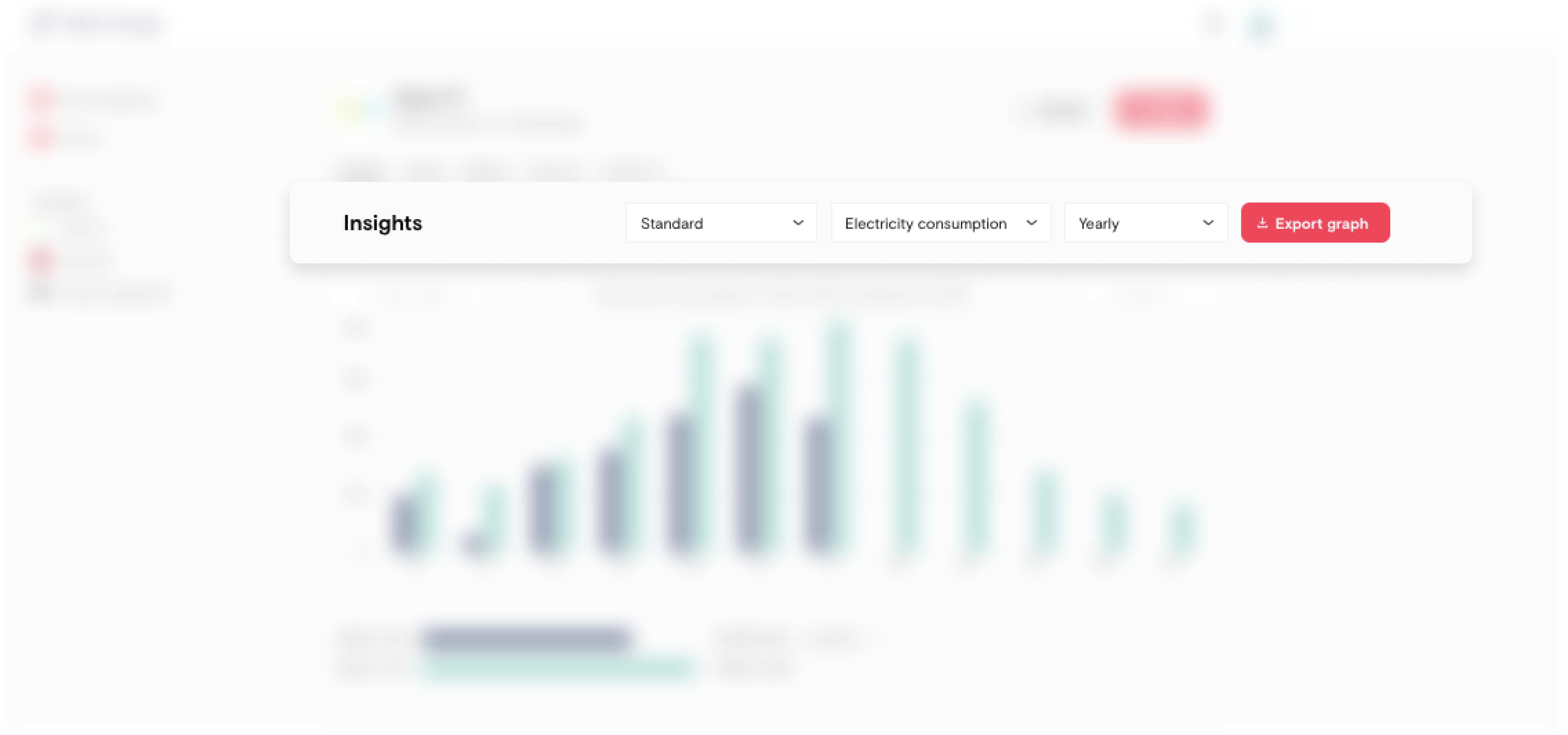
- Clearer dropdown selections: We’ve rearranged dropdown menu based on a more intuitive and clear logic. Now, users can use the first dropdown to specify the type of graph they want to see; the second to define the category of utility data; and the third to determine the time frame to be displayed on the graph.
- Style wise, It maintains the same layout as the previous version, so the changes we do won’t cause extra cognitive load for our users.
- Information structure wise, we’ve added 2 calculated options in the second dropdown: “electricity consumption” and “electricity return delivery” to add depth to the full picture of electricity usage of a building.
- Improved graph title, context & legend: The updated graph title now clearly indicates the utility type, unit, and time frame. It allows users to understand the data at a glance without referencing back to the dropdown selections.
- Cleaned up utility labels in the backend: Most users only gets to interact with provided aggregated data in the HE platform, but there’s a lot in the play in the backend. With legacy of utility labels through out years, we get it all sorted and cleaned up and sort the hierarchy of different types of labels, so the calculation is crispier and the platform is faster now.
Benchmark
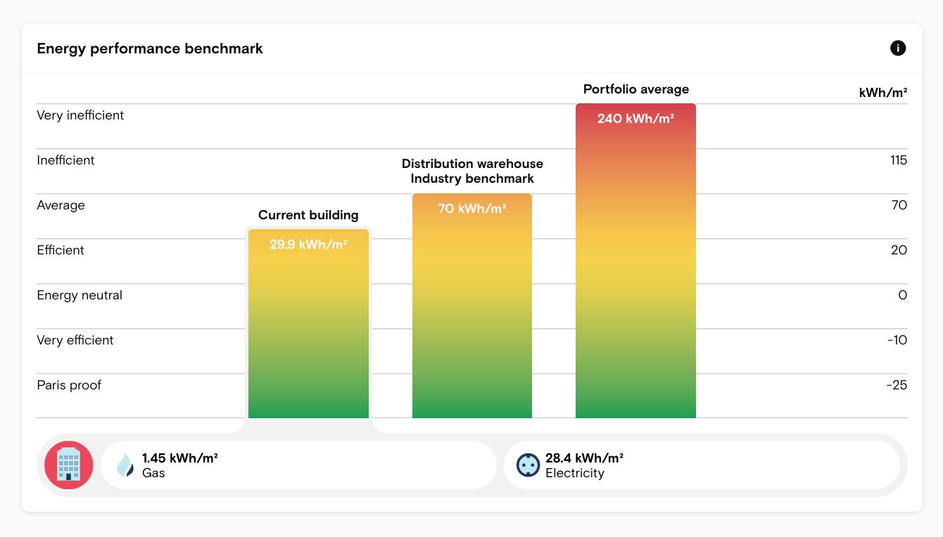
- Redesigned for a integrated, intuitive energy performance overview: We've combined the previously separate charts into one cohesive view, retaining the familiar thermometer-style indicator—greener means better energy efficiency. The chart’s legend area now clearly displays the utility sources contributing to the current building’s energy intensity, using grey shading for visual distinction.
- Improved naming for clarity: This feature block has been renamed to “Energy Performance Benchmark” to more accurately reflect its purpose. In the updated design, each bar is clearly labeled, allowing users to quickly understand what each value represents at a glance.
- Enhance interaction for better understanding: Interactive elements have been added throughout the feature block.
- Hover: Users can now hover over the “i” icon on top-right for a clear definition of energy intensity in our platform. Each bar also includes a tooltip with detailed explanations to aid interpretation.
- Click: The legend below the chart shows utility sources and their values. Clicking a source opens a pop-up with direct links to the relating meters, reinforcing our commitment to data transparency and accuracy.
Navigation
- Persistent filters for seamless navigation: Now, when you filter your portfolio—say, by location—and view a building’s details, your filters stay in place when you return. No more losing your search context—just a smoother, more focused experience. This experience spreads across the platform, wherever there is a filter.
- Navigation improvements:
- Dynamic page titles: When you look up in the title in browser, you’ll notice it describes where you are at, with hierarchy for improved navigation clarity.
- Navigation steps are available in browser history: You can use browsers’ back or forward button to visit our platform which can trace through your browsing crumbs.
- Bookmarking and secondary click are available: We’ve integrated modern browser’s common behavior to improve usability and navigation across the platform.
- Information structure change: The "Meters and Sensors" tab has replaced the former "Data" tab. It highlights the hierarchy and status of meters and sensors, offering more detailed insights and improving feature discoverability on the page.